4 Tips for a Thanksgiving Décor Color Refresh
Thanksgiving may just be America’s most traditional holiday. So many established elements come to mind when November rolls around. Big family gatherings. Huge turkey dinners with all the fixin’s. Pilgrims. Cornucopias (“horns of plenty”). Dried corn and cornstalks. Gourds. Pumpkin pie.
And traditional fall colors – which often means orange, orange, and more orange.
Tradition is great, but that doesn’t mean you have to let your holiday décor be limited by what has come before. Especially when it comes to colors. It’s time to move beyond the monochromatic! So here are our best tips for spicing up your season style by going beyond what’s always expected.

Add Complementary Colors
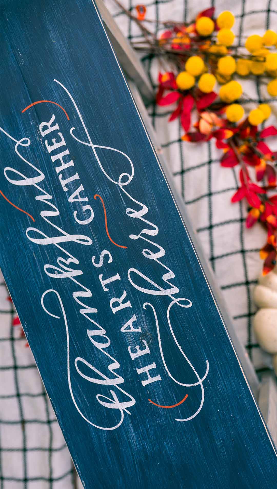
Okay, so you still want to include a fair amount of orange in your Thanksgiving decorations. Nothing wrong with that, and it may even be hard to avoid. The point is to not stop there.
A great way to set off that orange is to include a color that complements it. In this case, blue. Remember that complementary colors are hues that “opposite” each other on the color wheel. Starting with the three primary colors: Blue is opposite of orange (red plus yellow). Red is opposite of green (blue plus yellow). And yellow is opposite of purple/violet (red plus blue).
Why do these colors look good together? It’s all in your head – and by your head we mean your brain. There’s actually a scientific reason these colors go together. So “trust the science” and try some complementary colors in your Thanksgiving décor this year.

Embrace Color Families
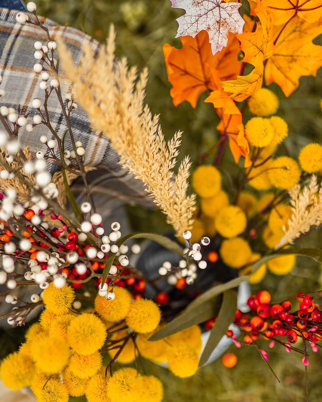
Another approach is look for variation within a color family. The key is to think beyond just the bright orange you find on a pumpkin (or an orange). After all, having everything in your home be bright orange would quickly become overwhelming! But you can stay within that color family and still include a wide variety of different hues.
Orange comes in many different shades. It can be more yellow or more red. It can be lighter or darker (shading toward brown). Working within this color family can give you a wide range of options, all of which will go well together, but without overdoing it.

Warm Things Up
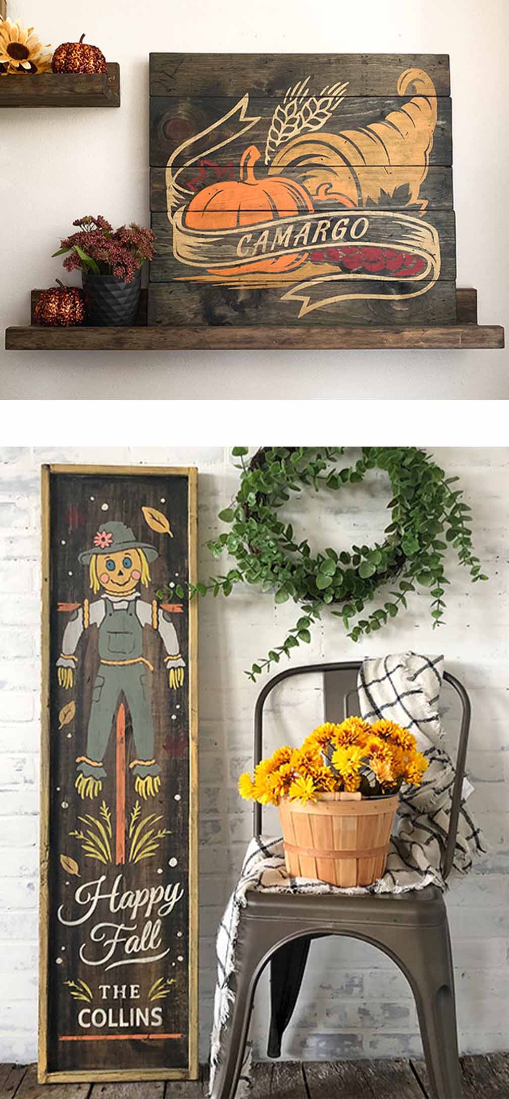
A similar idea is to work with what are commonly called “warm colors.” Simply put, the warm colors include various shades of red, orange, and yellow. Cool colors, by contrast, include shades of blue, green, and violet/purple. One way to remember is that warm colors evoke the colors of fire, while cool colors reflect water or plant life.
Again, the reasons these colors have different effects on us go way beyond tradition; there’s a lot of deep psychology involved.
The reasons they’re so appropriate for Thanksgiving is largely due to the time of year. Winter is approaching, the weather is getting colder, so of course warmer colors have greater appeal. They’re also largely the colors of harvest time, and autumn leaves, so we’re used to seeing these colors in the fall already. They comfort us as the seasons change.
But they’re not all the same! The many shades of warm colors provide a rich palette for Thanksgiving decorating.

Pop Some Unconventional Color
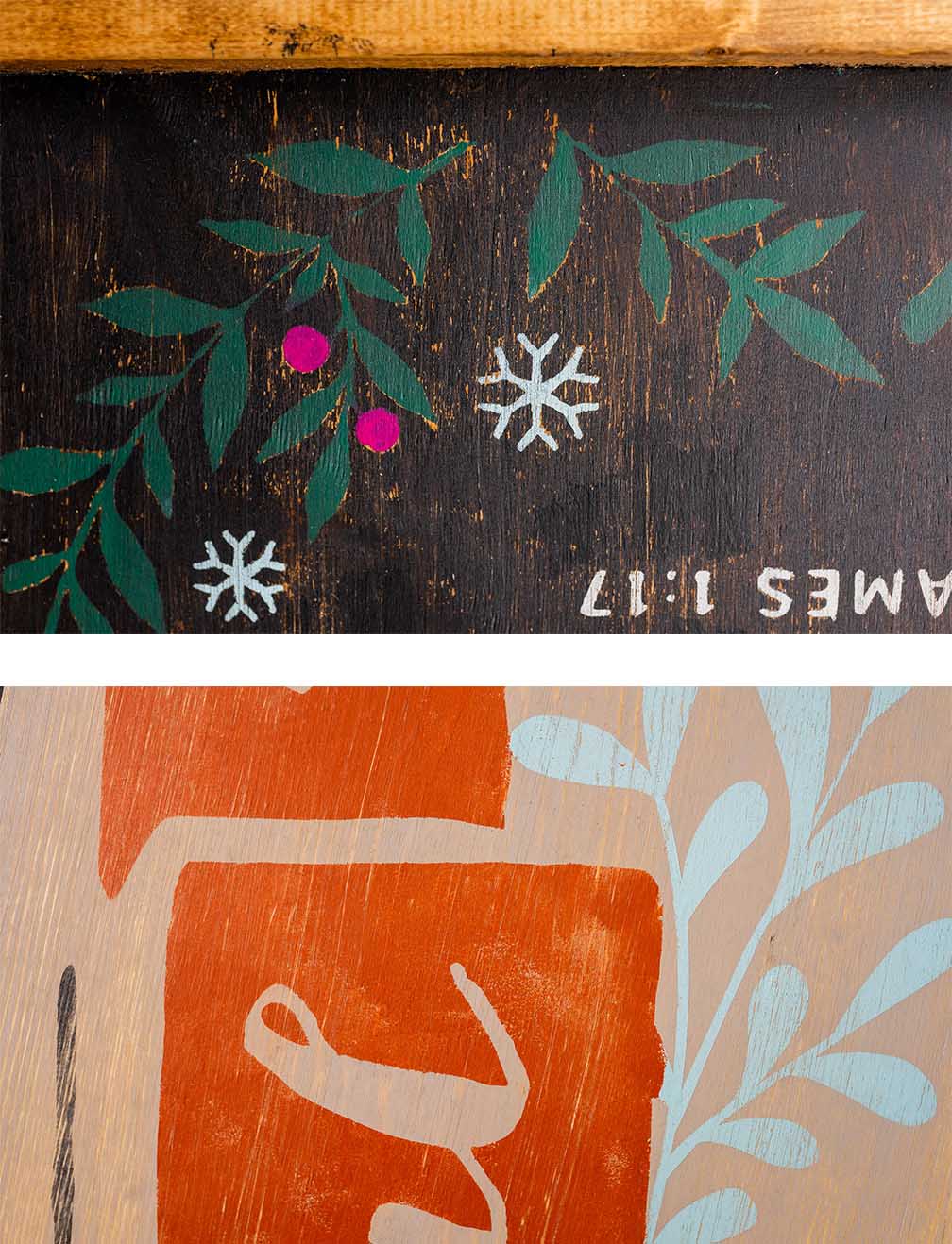
Finally, let your imagination run wild and think of ways to add “pops” of color to your décor. The rules don’t really apply here. That is, the only real question is “do you like it?” Pick your favorite fun colors and add splashes here and there. It’s a great way to really break out of the traditional approach and make your style your own.
In fact, that’s one of our core principles at Board & Brush. We excel at helping you make your projects reflect your unique style and personality. From signs and trays to boxes and porch planters, you’re always free to choose the colors that best reflect who you are, or that match or complement your personal style.

To get started creating something unique for your home, contact your local studio to schedule a workshop. Or, if your local studio is not yet open for business, visit our new “Shop Local” site to place an order for pickup!


